Analytics
The Analytics dashboard visualizes tool usage trends, performance metrics, and user activity across your MCP integrations. Use it for aggregate trends over a time window; for individual events, use Logs. Open it from Monitor > Analytics.
To build your own queries and boards beyond this prebuilt dashboard, use Explore and Dashboards. Those pages read ClickHouse only. On-prem they appear after you bring your own ClickHouse and set LOGS_READ_STORE=clickhouse.
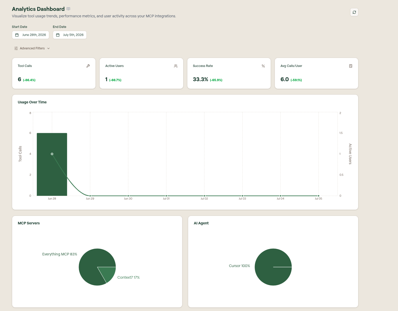
Date range and filters
- Start Date and End Date set the reporting window. Every metric and chart on the page reflects this range.
- Advanced Filters narrows the dashboard by user and AI agent. Overview also supports MCP server and grouping filters; Skills & Commands adds a specific skill or command filter.
- The refresh button at the top right reloads the data.
Each stat card shows the change versus the previous period of the same length.
Enable more data sources
Willow gateway activity appears automatically. Open Data sources to connect agent OpenTelemetry, scanner discovery, and Guard Hooks.
See Analytics Data Sources for the source cards and configuration steps.
Summary metrics
Four cards summarize the selected range:
| Metric | Description |
|---|---|
| Tool Calls | Total number of tool calls made through the gateway. |
| Active Users | Distinct users who made at least one call. |
| Success Rate | Share of tool calls that completed successfully. |
| Avg Calls/User | Average number of tool calls per active user. |
Usage Over Time
The Usage Over Time chart plots activity across the selected range on a dual axis: Tool Calls as bars (left axis) and Active Users as a line (right axis), so you can see volume and reach together. Use it to spot spikes, drops, and adoption trends.
Below it, two donut charts break the same activity down by MCP Servers and by AI Agent, showing each one's share of total usage (for example, Everything MCP 83% and Context7 17%, or Cursor 100%).
Breakdown tables
The lower half of the dashboard holds detailed tables and charts. Each table has its own Export CSV action.
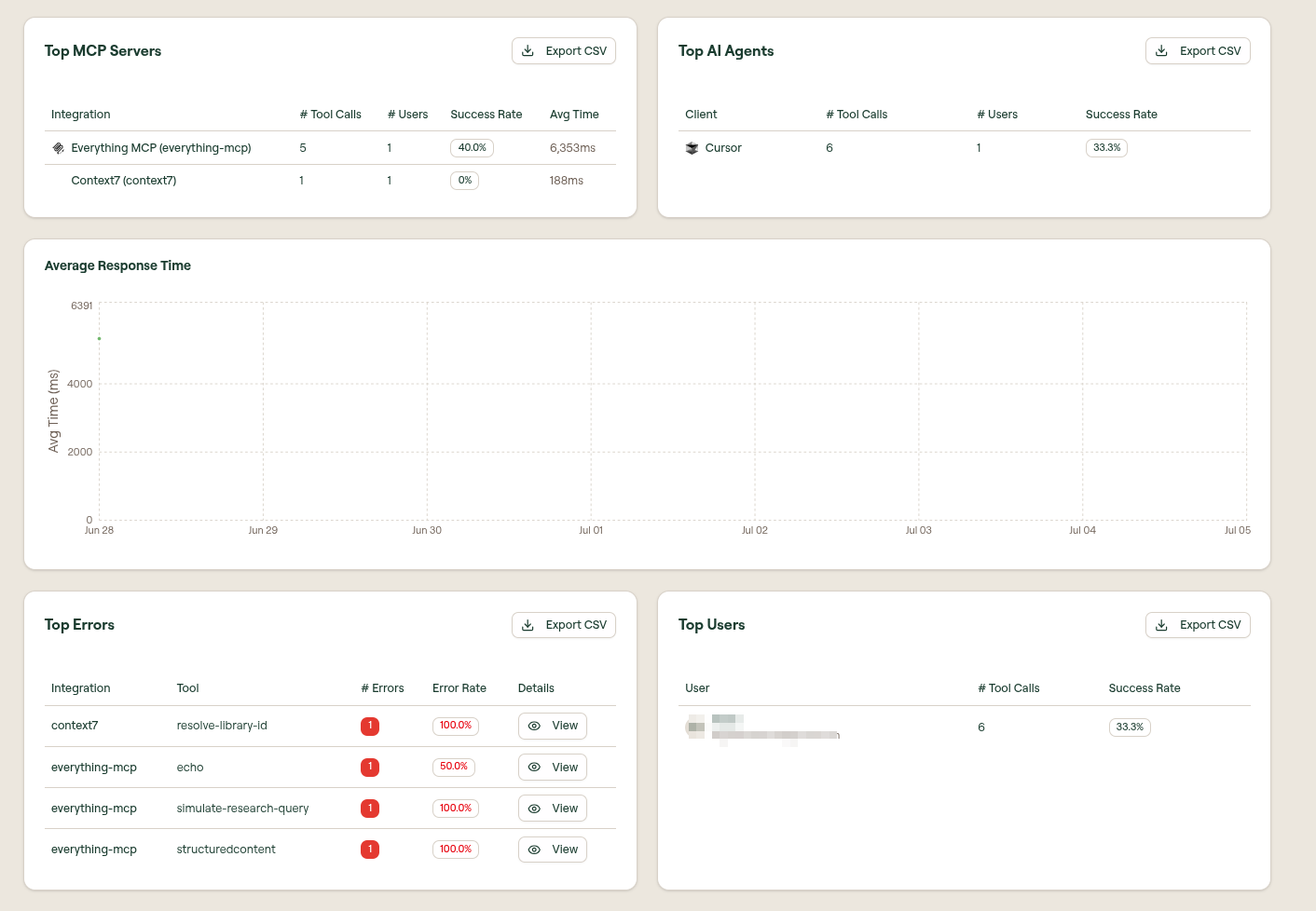
| Section | Type | Columns |
|---|---|---|
| Top MCP Servers | Table · Export CSV | Integration, # Tool Calls, # Users, Success Rate, Avg Time |
| Top AI Agents | Table · Export CSV | Client, # Tool Calls, # Users, Success Rate |
| Average Response Time | Line chart | Average tool response time (ms) plotted across the range |
| Top Errors | Table · Export CSV | Integration, Tool, # Errors, Error Rate, and a View action to inspect each error. Shows "No data available" when there are no errors |
| Top Users | Table · Export CSV | User, # Tool Calls, Success Rate |
Guard breakdowns
Below the usage breakdowns, Runtime Guards and Build-time Guards each have their own section and Export CSV action. These sections show No data available when there are no results for the selected range.
Export data
Select Export CSV on any table to download that breakdown for offline analysis or reporting.
What to do next
- Explore: build ad-hoc analytics queries with the guided builder or WQL
- Dashboards: assemble your own visuals into a shared board
- Logs: drill from an aggregate trend into the individual events behind it
- Investigate with Logs: diagnose a spike or a drop in success rate
- Radar: review flagged security and operations gaps
- Dashboard: the at-a-glance overview of your organization