Analytics
Click Analytics in the sidebar to see your own tool usage: how many calls you've made, which servers and AI clients you lean on, how often calls succeed, and how fast they run. Everything on this page is scoped to you. It's your activity, not your team's or your organization's.
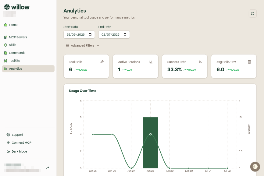
Set the date range
The Start Date and End Date pickers at the top control the window every metric, chart, and table on the page reflects. Change either date and the whole page updates. Use the refresh button in the top-right corner to pull in the latest data for the range you've chosen.
Filter and group
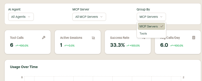
Open Advanced Filters to narrow what's counted and change how it's summarized. There are three controls:
| Control | What it does |
|---|---|
| AI Agent | Limit the page to a single client (Cursor, Claude, Claude Code, GitHub Copilot, Windsurf, or VSCode), or leave it on All Agents |
| MCP Server | Limit the page to one server, or leave it on All MCP Servers. The list is the servers you actually have connected |
| Group By | Choose whether the breakdowns below are organized by MCP Servers or by Tools |
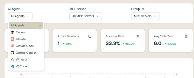
Filters stack. Pick one agent and one server to see, for example, only your Cursor calls to Context7.
The metrics at a glance
Four tiles summarize the selected range:
- Tool Calls: the total number of tool calls you made.
- Active Sessions: how many distinct sessions those calls came from.
- Success Rate: the share of calls that completed successfully.
- Avg Calls/Day: your average number of tool calls per day.
Each tile also shows a percentage with an up or down arrow, indicating whether that metric is trending up or down over the range.
Usage over time
The Usage Over Time chart plots your activity day by day, with tool calls as bars and sessions as a line on a second axis. It's the fastest way to spot your busy days and quiet stretches.
Where your usage goes
Two donut charts show how your activity is distributed, one across your MCP Servers and one across your AI Agents, so you can see at a glance which servers and clients you rely on most.
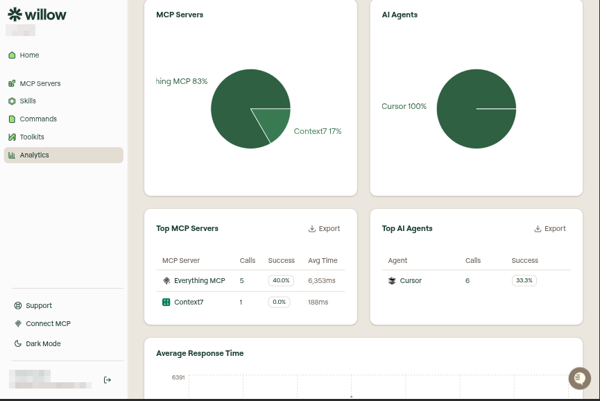
Below the donuts, two tables rank the same data with the numbers behind it:
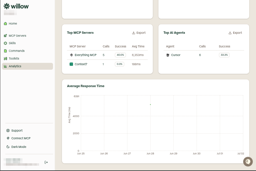
- Top MCP Servers: calls, success rate, and average time per server.
- Top AI Agents: calls and success rate per client.
Click Export on either table to download its rows.
Response times
The Average Response Time chart at the bottom of the page tracks how long your tool calls took, in milliseconds, across the range. Watch it for servers or periods where calls are running slow.